Zuckerpeitsche
—
Redesign der Marke

Zuckerpeitsche is an artisanal, Swiss syrup producer founded by a trained chef. Each batch is handmade using certified organic ingredients and every bottle is defined by a carefully constructed flavor profile.
While the existing design was distinctive, it did not achieve its full potential in communicating its craft offering. The goal was to refine the visual language to upgrade Zuckerpeitsche's positioning and create a stronger identity across all products.
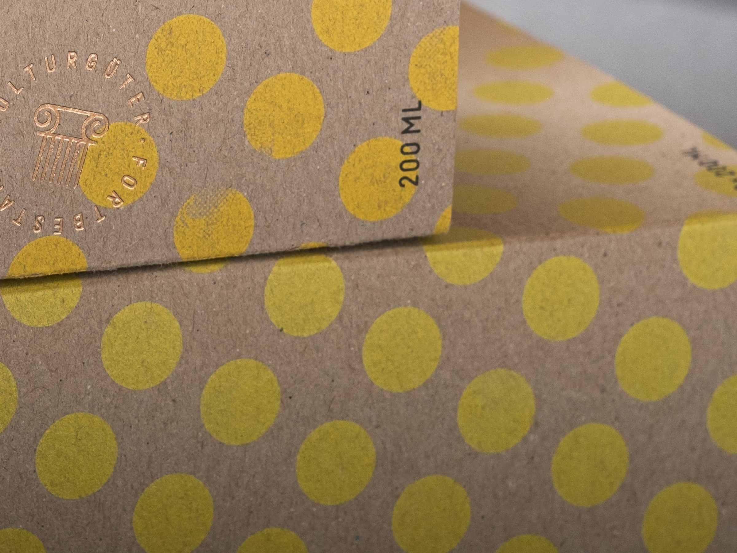
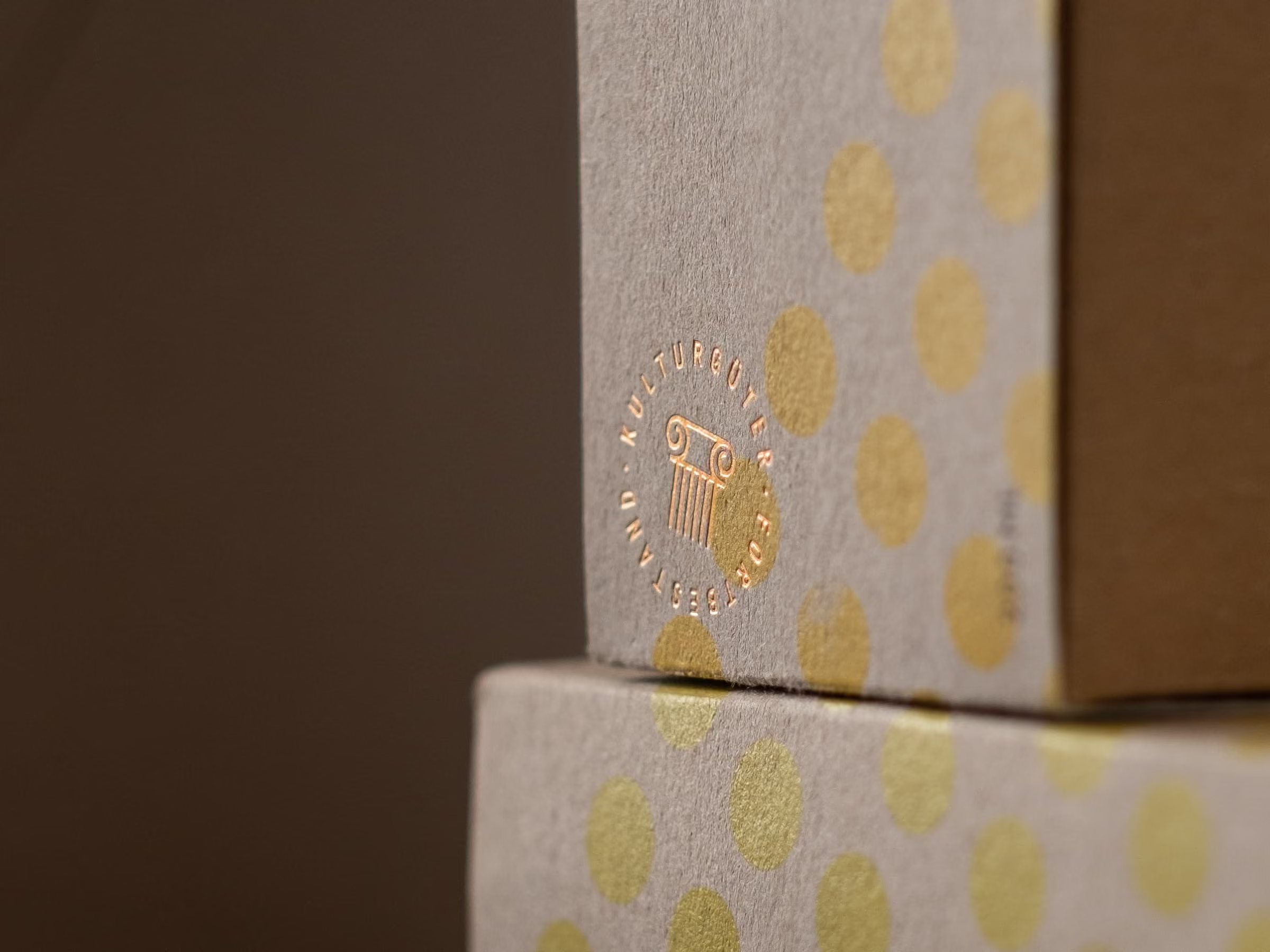
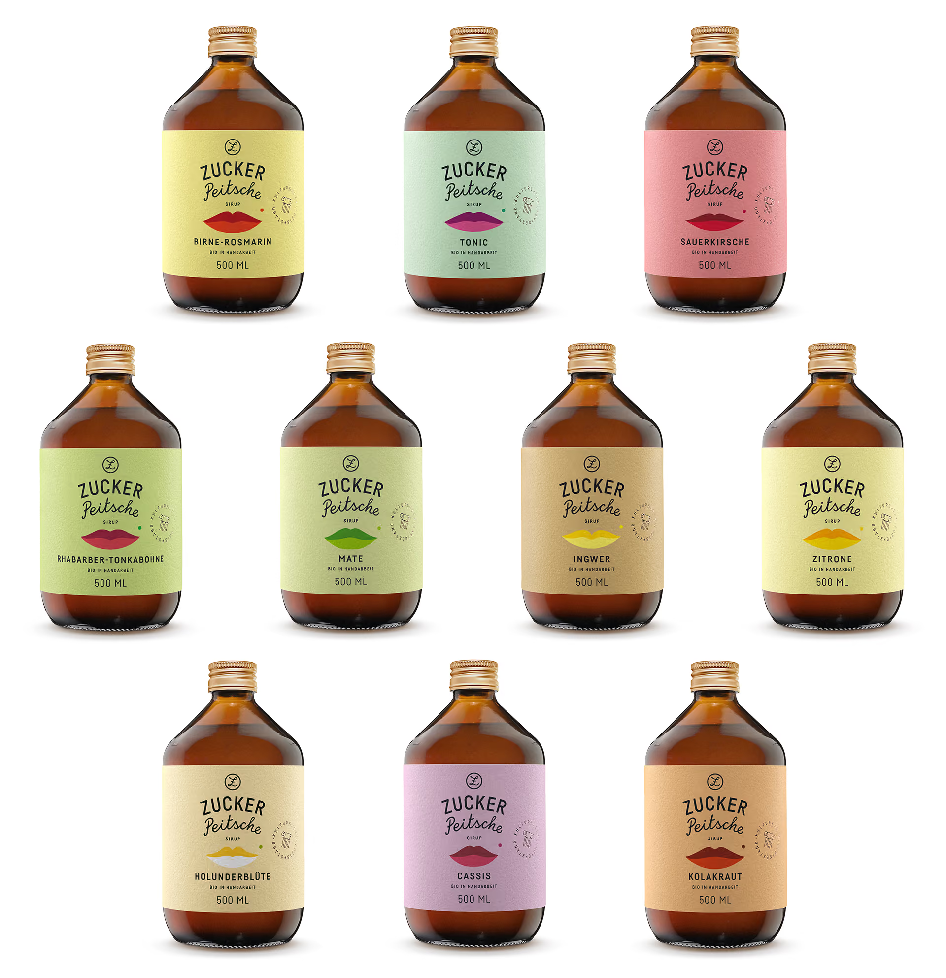
kvint worked closely with the client to clarify the brand’s vision, which shaped a more focused visual direction. The former pin-up design was reconceptualized into a clearer symbol: a bold pair of lips that connect sensuality with taste. Through steady exchange and refinement, the new identity took shape.
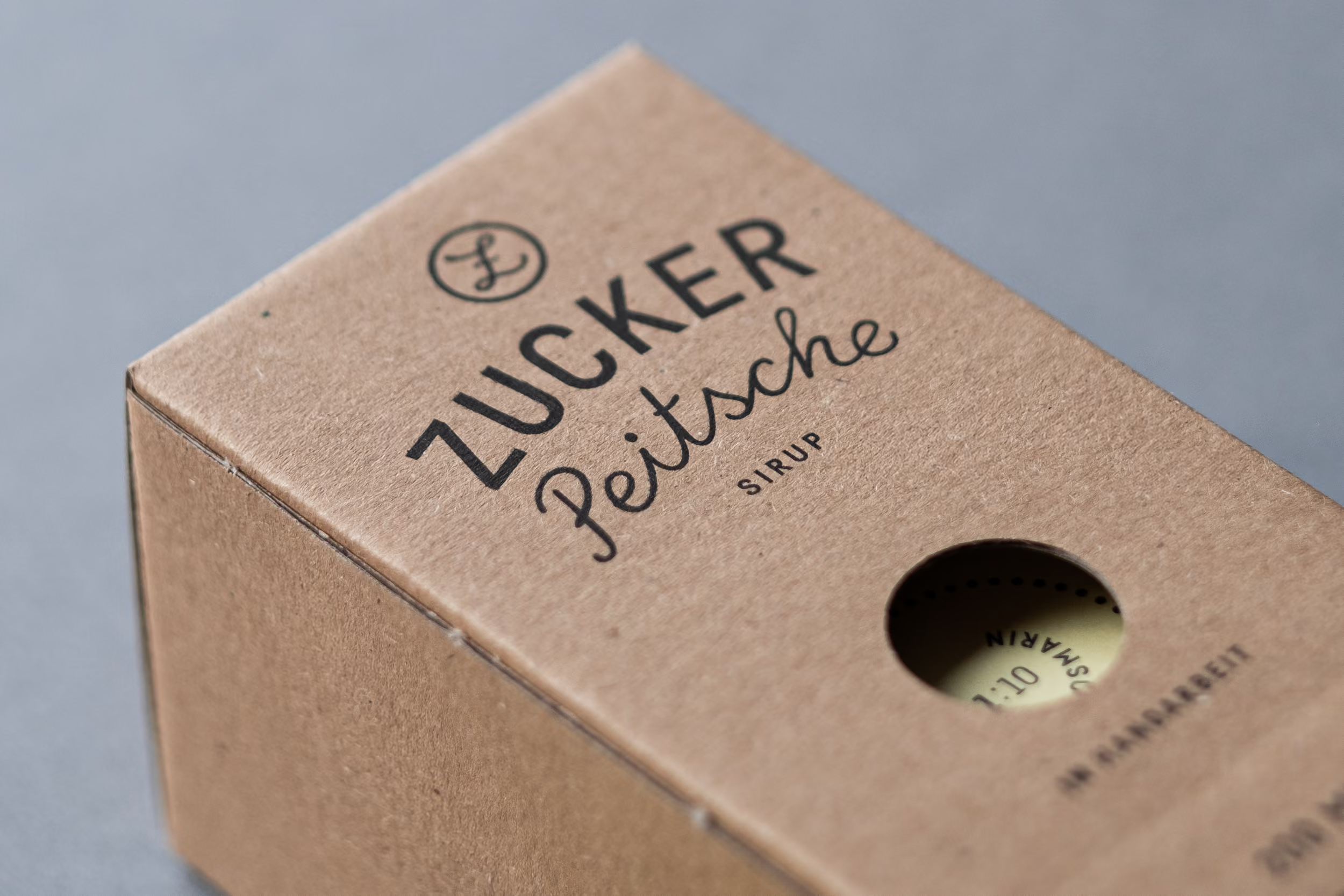
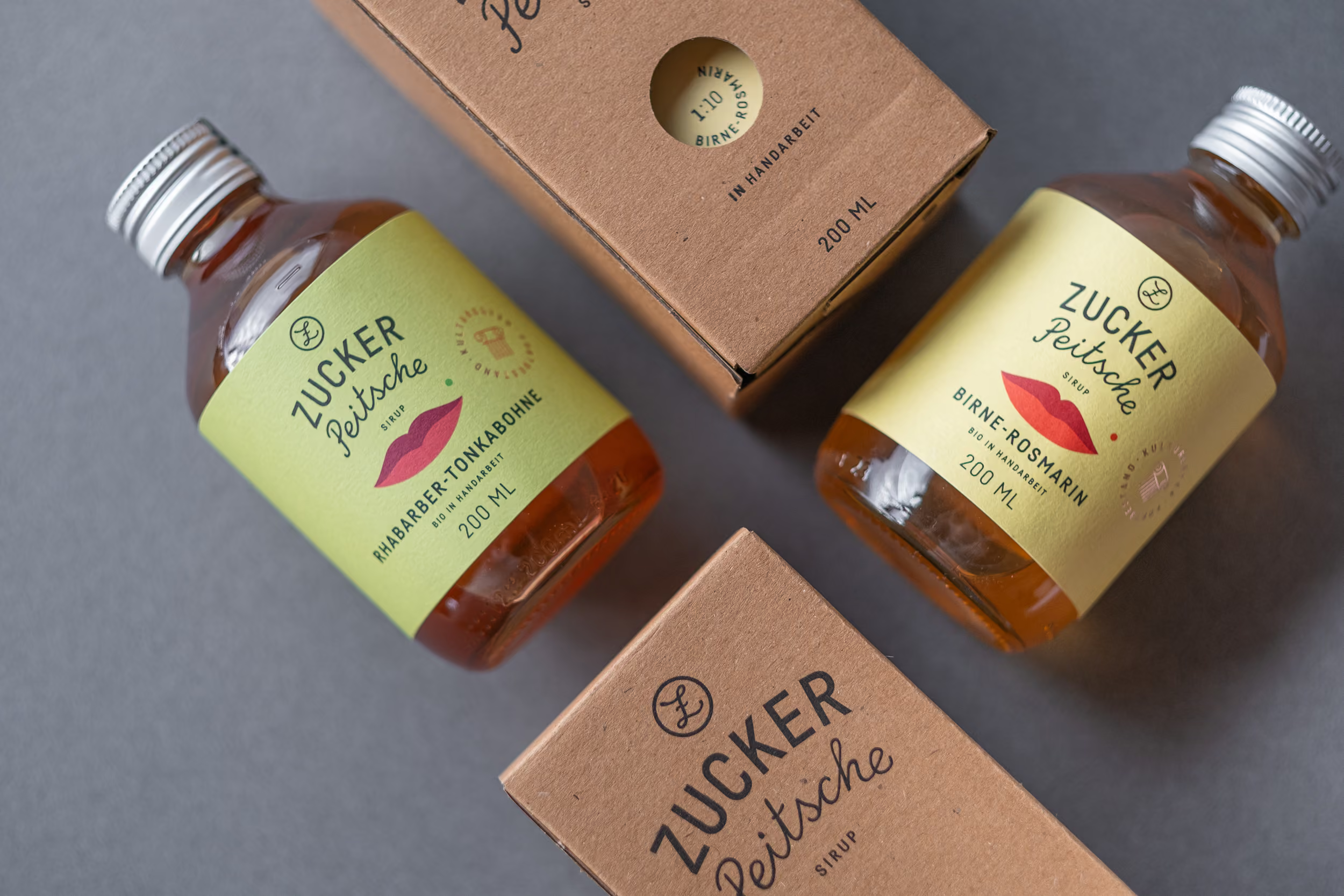
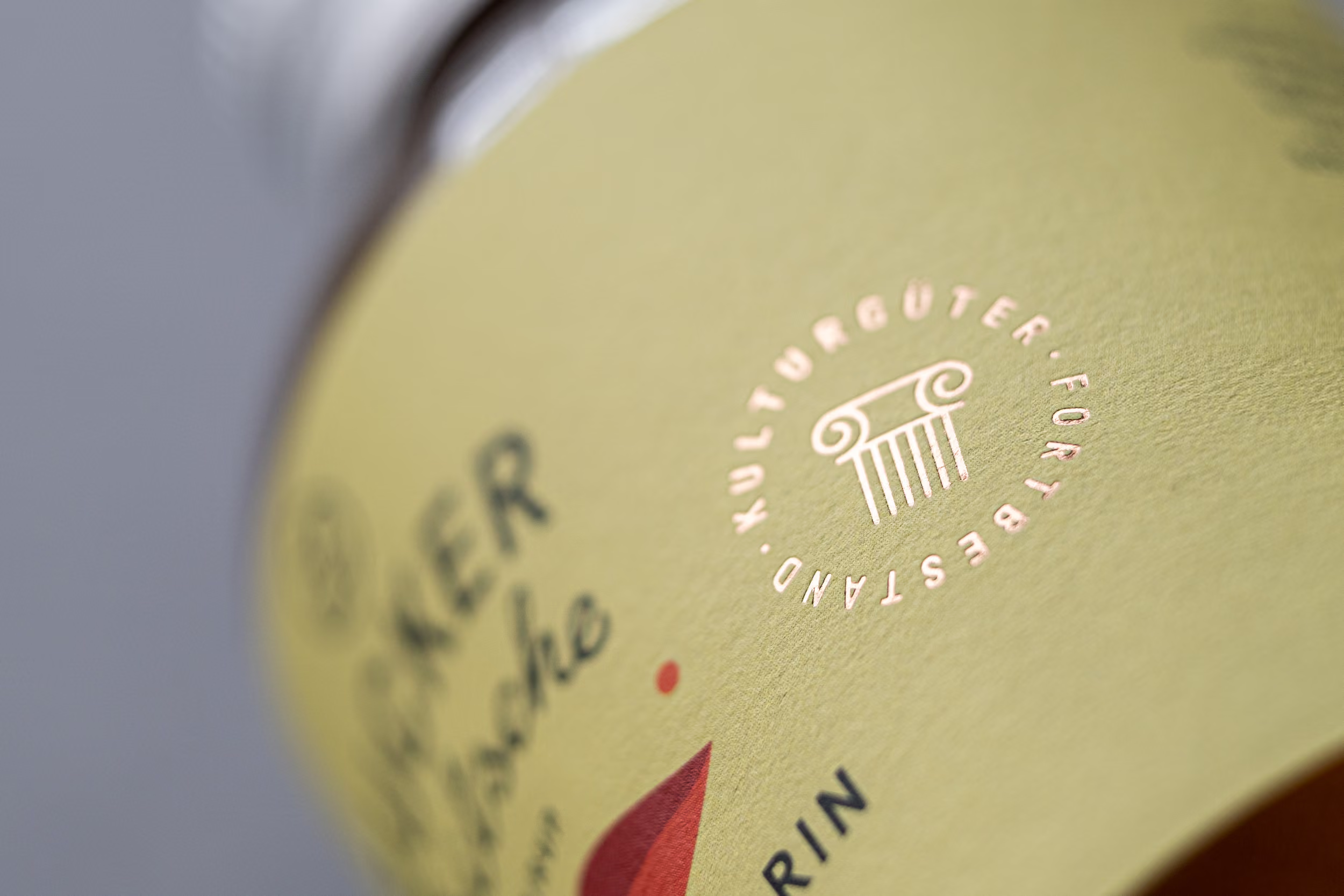
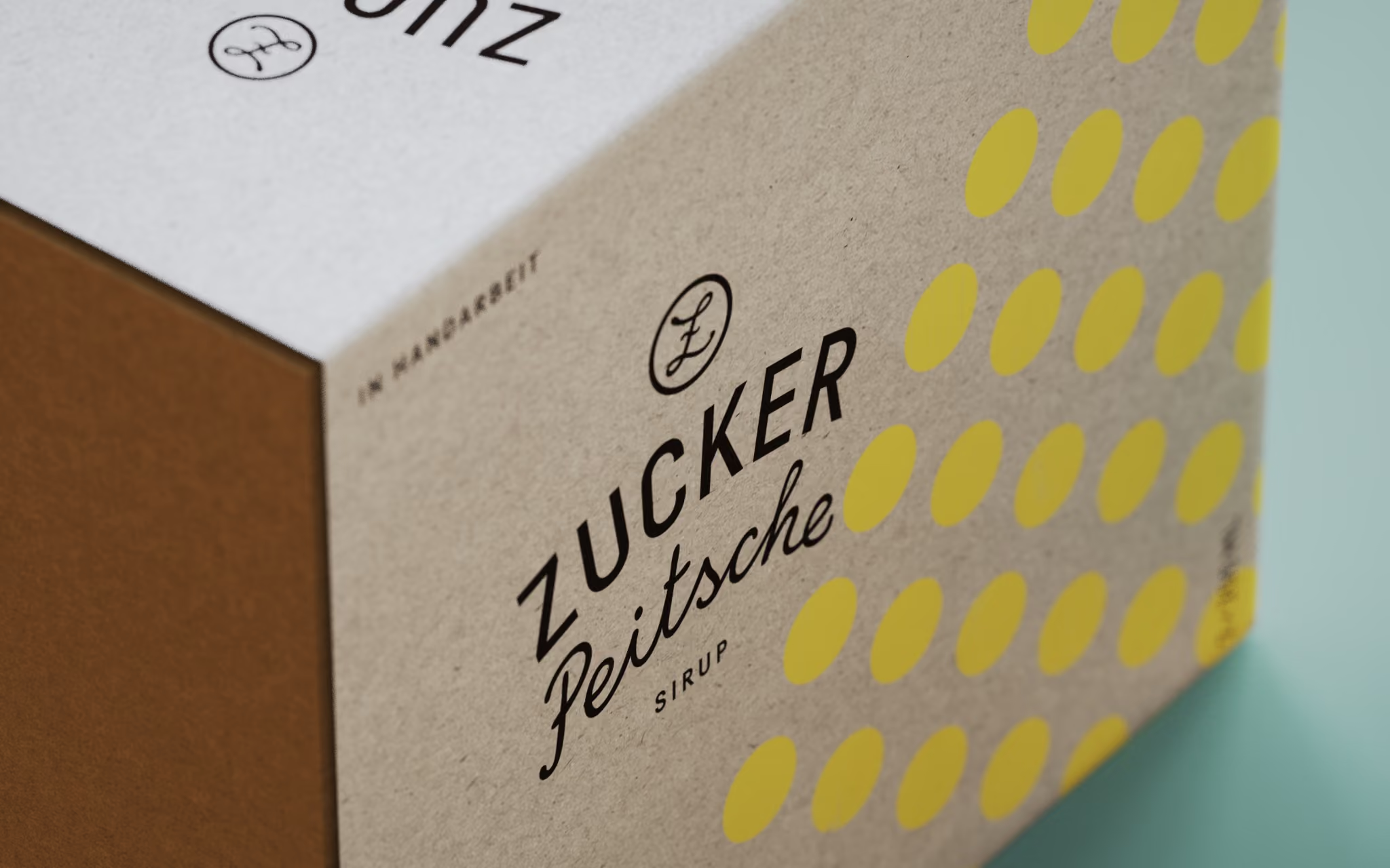
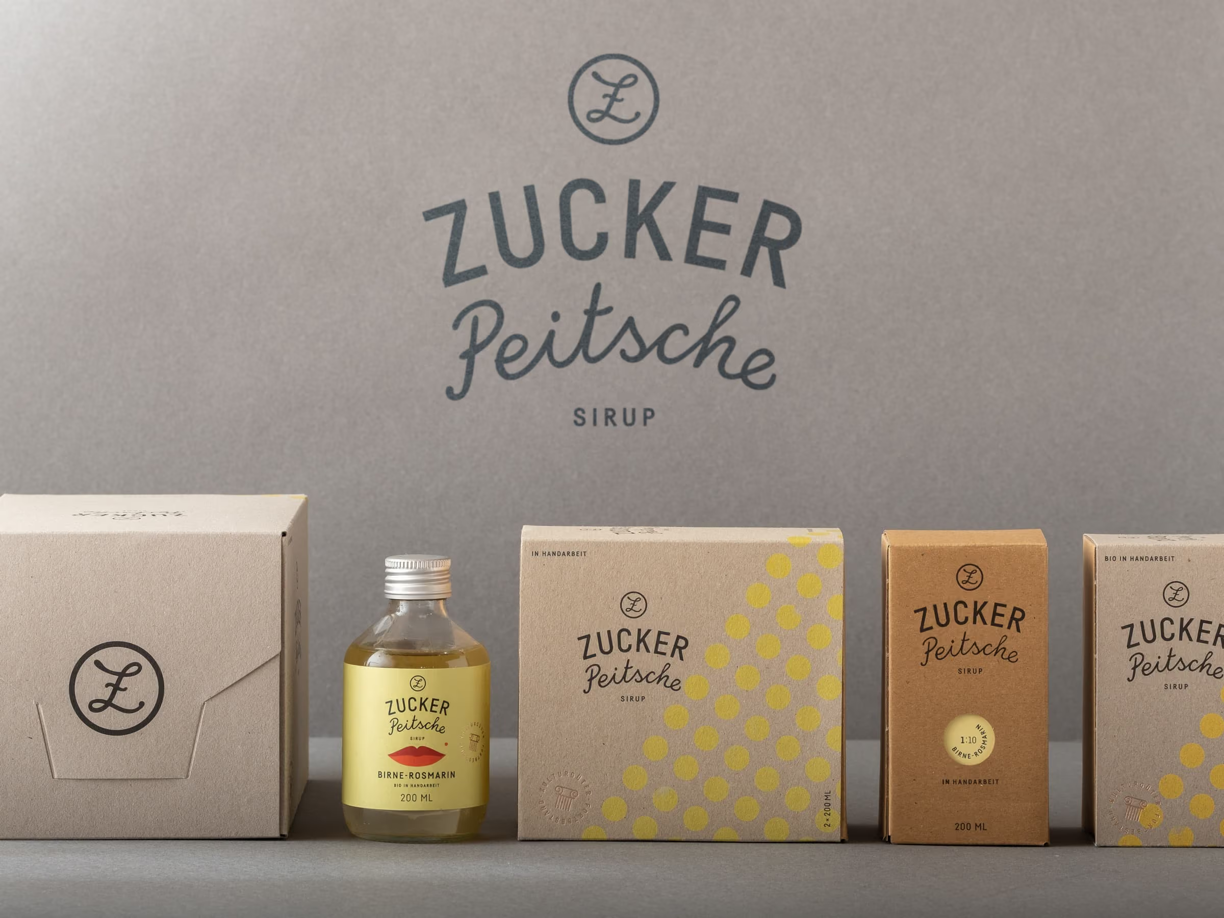
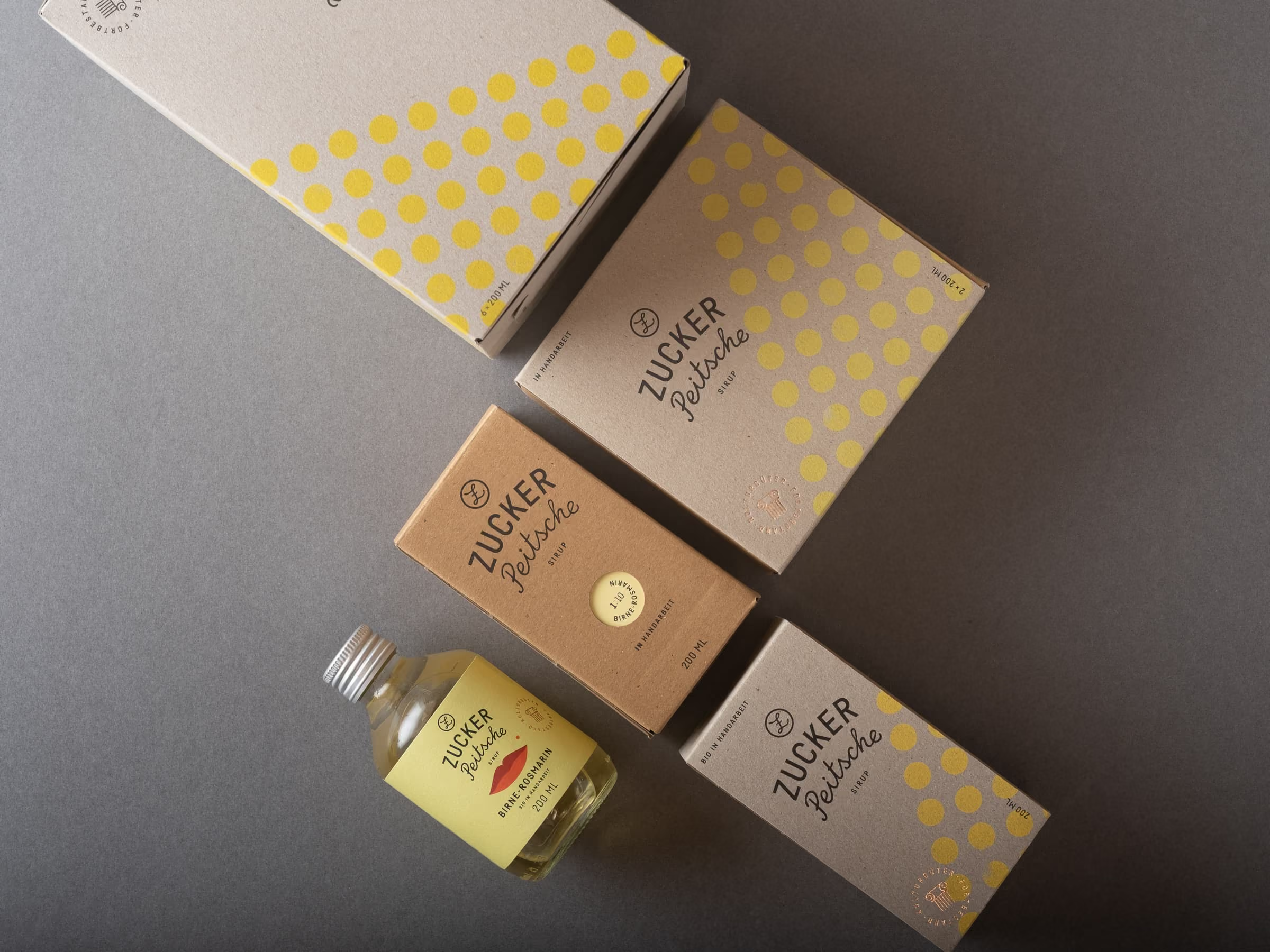
The outcome was a new logo, a considered label system, and a cohesive packaging concept. Confident in tone, each element brings focus to the bottle and gives the product the presence it deserves. A modular system of sleeves allows individual bottles to be combined into refined gift sets while keeping the packaging consistent across all flavors.